TRANQUIL
A mobile app for meditation and mindfulness
UI Animation for a mobile app
UI Animation for a mobile app

Tranquil is a meditation app for all occasions. Most people associate meditation with relaxation, but it can also help you focus, energize, and motivate. Meditation can take many forms, and Tranquil allows users to explore to find guides that match their taste and needs.
View the Behance version of this case study here.
Target users are young people who are having issues with stress and want to find smart solutions to use at home and/or at work. They are typically 25 to 40 years old and are avid smartphone users.
UI Animation Designer
July - October 2022
Adobe XD and After Effects
CareerFoundry student project
I identified the core brand values of the app, then developed a style guide that would express those values.
Tranquil's logo is combination of a water droplet and a lotus flower bud. Both imagery have associations with meditation and align with the calm mood of the brand.

Static

Animated





Logo - Baskerville Display PT Bold
Headings: Cambria
Body: Proxima Nova
#22223B
#4A4E69
#D0D5DE
#8D99AE
#A8DADC
#A28F9D
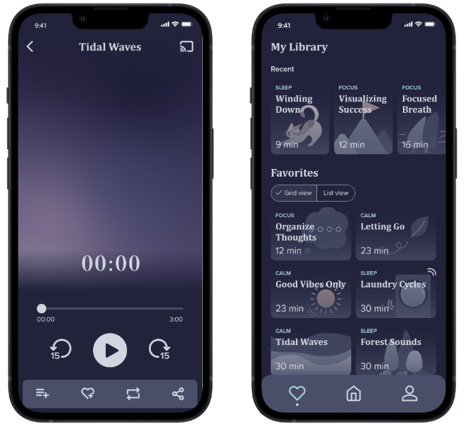
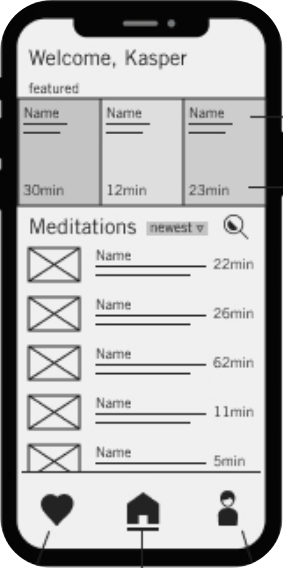
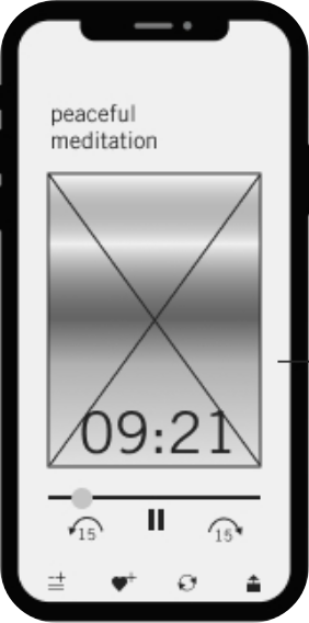
I was provided with four mid-fidelity wireframes and applied the style guide to create the high fidelity screens shown below.

Preloader
Home
Guide play
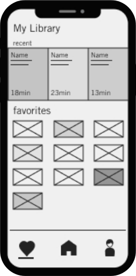
Favorites

Preloader
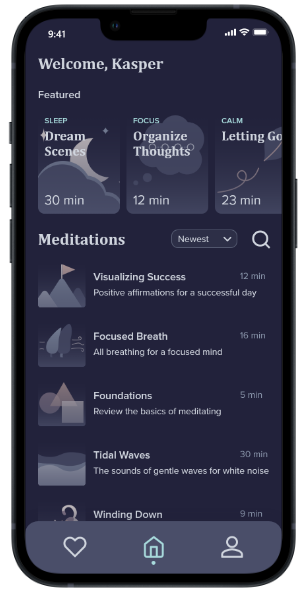
Home
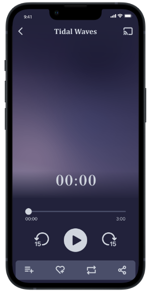
Guide play
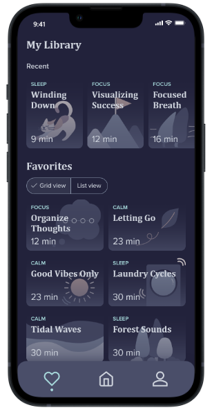
Favorites
Before jumping into animating the high-fidelity designs, I created a user experience narrative to demonstrate how the UI animations would help the brand portray its values through the user experience.
It is narrated from the point of view of Eva, a woman in her mid-twenties using the app to destress at the end of her long work day.
When Eva opens Tranquil, a preloader screen greets her with a nicely paced (but concise) logo animation. The slow animation has clear intentional movements and acts as a preview of the meditation guides that the app has to offer.
The preloader screen transitions to the home screen, welcoming Eva back, and showing her a variety of featured and recent meditation guides. The guides are listed with a title, short description, and duration, allowing her to quickly skim to see if any of them call out to her that day.
Finding that nothing catches her eye, she taps the "Favorites" icon on the bottom navigation menu to open her saved library. Her saved guides are accompanied by a related graphic so she can easily find and select the one she has in mind.
Her selected meditation begins, showing a slow animation with an auditory guide. She can also play, pause, rewind, or fast forward with the play controls at the bottom of the screen. She finishes her session feeling refreshed and relaxed.
I implemented the storyboards by exporting the high fidelity wireframes from Adobe XD into After Effects. I played around with the timing of each animation to create an atmosphere worthy of a meditation app.
For this particular app, the timing of the animations would play a large role. I had to walk a fine line between animations that were calming and annoyingly slow. The animations were to contribute to the Tranquil branding without interfering with the user experience. I did not want users to feel as if they were waiting, but at the same time, the pacing had to be noticeably slower than industry standard to feel gentle and soothing.
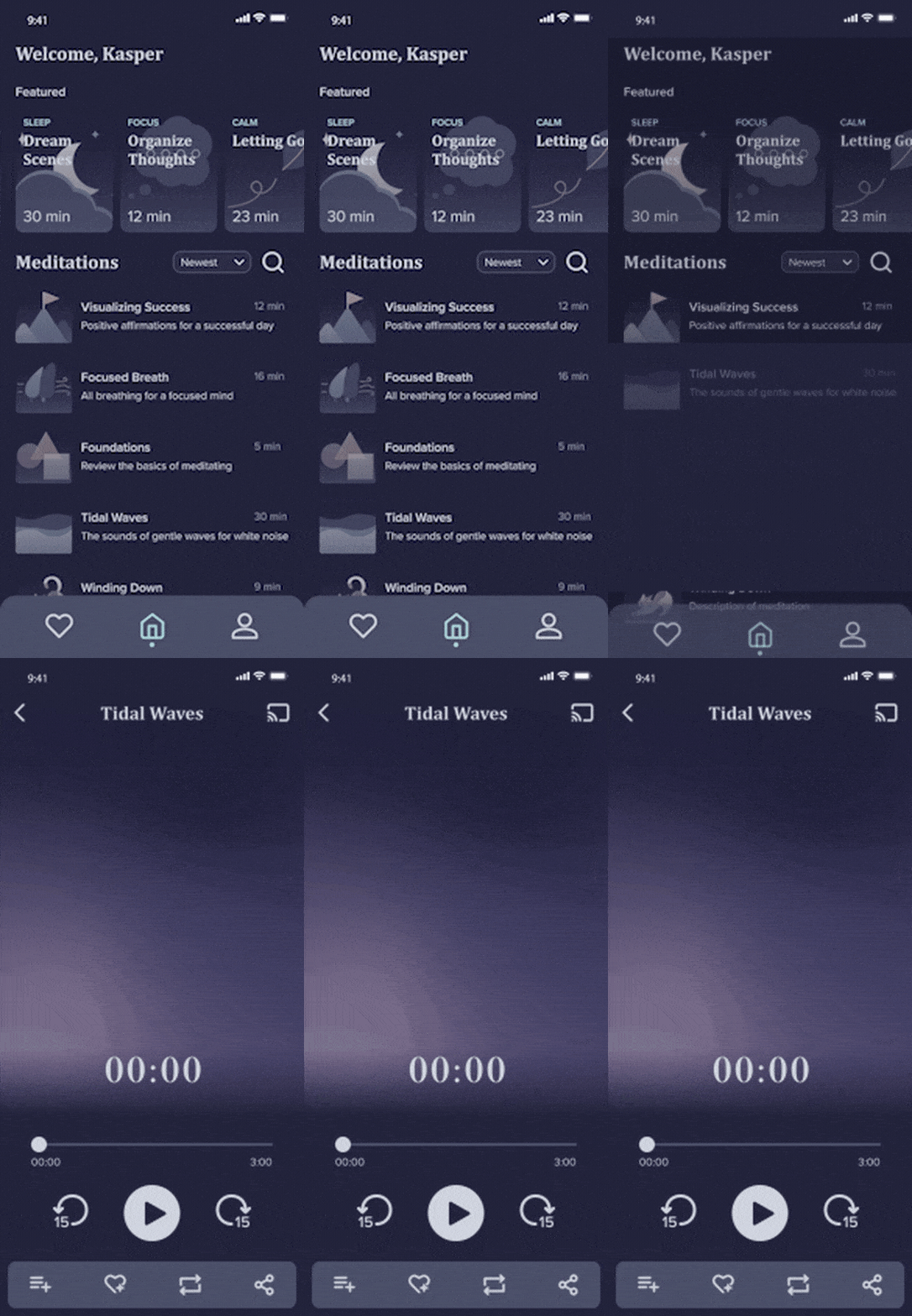
In the example below, I show how I tweaked the timing of the animation for opening a meditation guide. The original animation is based off the recommended speed in Material Design. However, as this is a meditation app, I slowed the speed down by about half to achieve the desired feeling.
Original timing

Revised timing
I limited the effects and plugins to those that would contribute positively to the overall user experience without distracting the user from their goals.
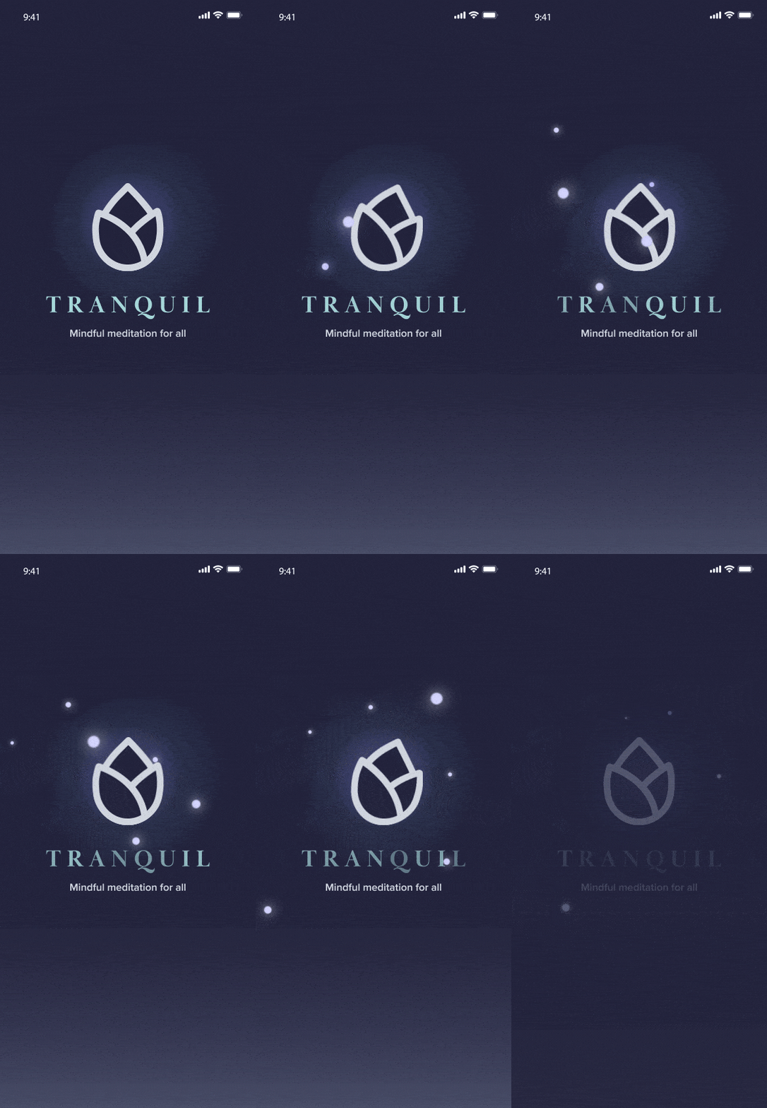
Most of the additional effects were used in the preloader animation, where I could more freely express the brand values without interrupting the user during a task. I started with some simple text effects where the characters of the logotype and tagline fade in and scale up in sequence.

The second part of the preloader animation only occurs when the app requires more time to load. This animation shows the lotus bud logo swaying in a breeze while glowing orbs float by.
I used is the CC Bend It effect to make the lotus bud logo look like it is swaying in a breeze.
A slow random wiggling effect was applied to the glowing orbs that float across the screen for more natural looking movement.
To pair with the orbs, I also added a text layer effect from the Animation Composer 3 plugin called "Wiggly Fade Characters" which adds a flickering effect on the logotype characters.
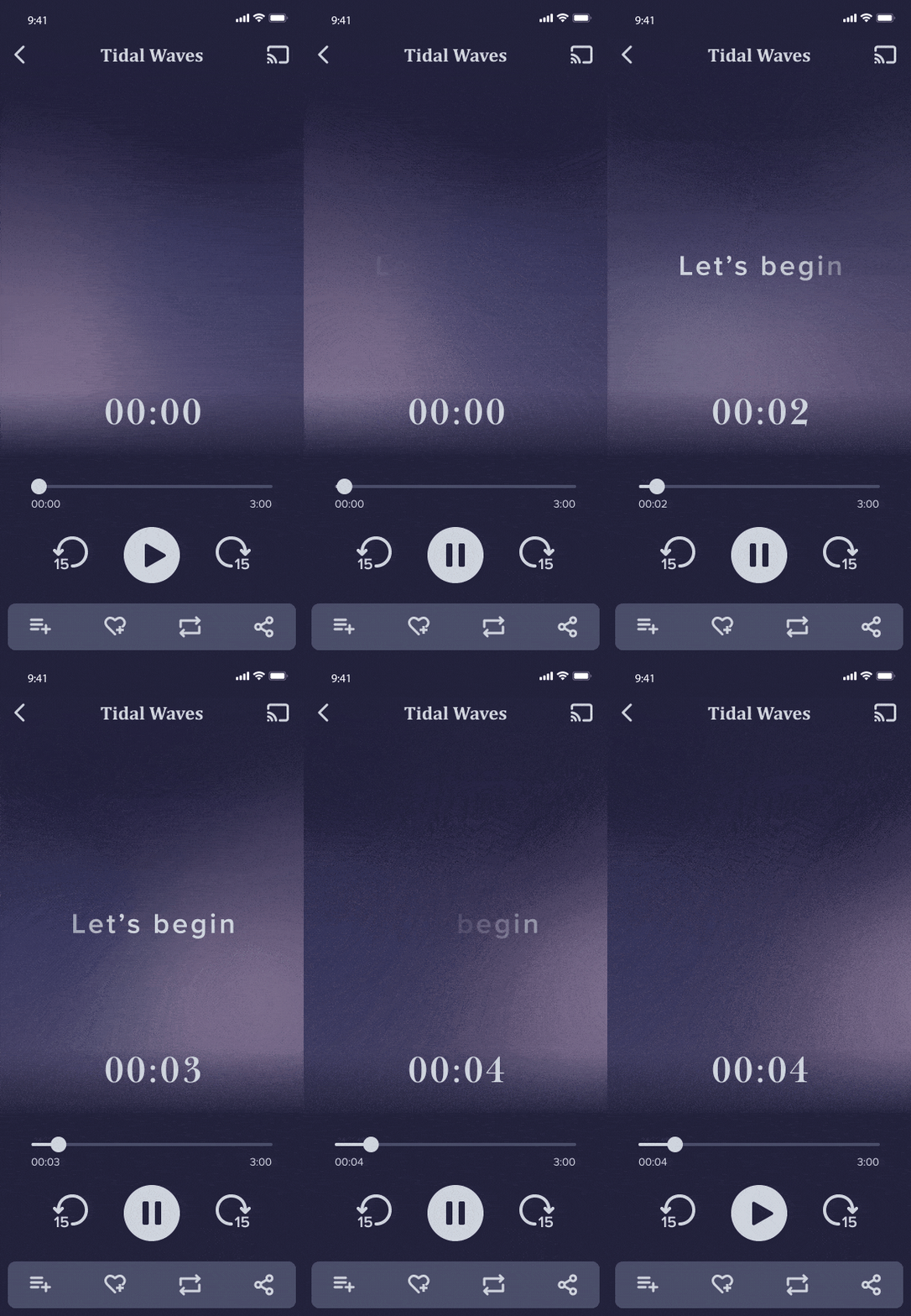
Finally, I used a four-point gradient animation as the main visual animation playing during the meditation guide. The movement is slow but not uniform, which lends a natural and organic calmness. The blurry quality does not allow the user to focus too much on the animation, and instead encourages them to focus on the meditation guide itself.
To signal the beginning of the guide, text fades in and out. This effect was implemented via the TextEvo plugin.
By selectively using these effects, I could refine the UI animation and make it more fully align with the branding values and overall vibe.
Once I finalized the UI animation for the app, I compiled it together with some 3D camera work into the presentation video below.