
Car charging made easy
Electric Vehicle Charging Station Finder
Electric Vehicle Charging Station Finder
ZapEV is a location-based responsive web application that helps electric vehicle owners find charging stations near them and their searched destination.
View the Behance version of this case study here.
UX & UI Designer
Nov 2021 - Feb 2022
Prott, Adobe XD
CareerFoundry student project
As fossil fuel resources wane and the negative environmental effects of their consumption are starting to be felt around the world, the electric car industry has stepped up to fill in a new, more environmentally friendly role in the automotive industry. As the supporting infrastructure is still being implemented, finding charging stations can still be difficult for electric car owners. They tend to be decentralized, disorganized, and are often broken down.
The expanding pool of electric vehicle drivers need charging stations outside their home that are easy to find and as easy to use as gas stations. ZapEV attempts to fill this role by providing EV drivers with an accurate, efficient, and easy to use location-based search engine for EV charging stations.
09
10
11
12
Of the various EV charging apps available, PlugShare and ChargePoint are the biggest competitors with the highest ratings on app stores.
ZapEV can cut into this increasingly crowded market by providing real-time information on charging stations of various networks.
I conducted user interviews with three EV drivers who fit the target profile. I was most interested in their common pain points and what kind of information they look for when searching for a station.
Charging EVs takes longer than filling up a gas-powered car, so I thought EV owners must plan their charging and avoid charging stations that are occupied.
"Sometimes I feel like there's too much information. I wish there was a filter."
"I feel like I need to download a new app every time I go outside the Tesla network"
My original hypothesis assumed that people plan ahead and find charging stations ahead of time, but the increasing number of charging stations available makes that largely unnecessary.
Especially for shorter trips, EV drivers just want to use whatever is convenient at the time. "Convenience" may look different depending on the user or the situation, but regardless they should easily find charging stations that fit their needs in the moment.
The following three user personas summarize the various goals, motivations, and frustrations found in the user research.

Archetype:
Organized, Curious, Anxious
Age 31 | Mechanical Engineer
Los Angeles, CA
College Graduate
Long-time partner
I get range anxiety whenever my battery gets below 50%, so I like to top it off whenever there is an easily accessible station nearby.
Monica moved from NYC to LA, and needed to purchase a new car to accommodate the commuter lifestyle. She bought her car after exhaustive research because it fit within her budget, and had the added bonus of making her feel socially responsible. She initially feared the effect charging would have on her schedule, but felt better once she knew Tesla had a well-established infrastructure of Superchargers throughout California.
Monica makes time to visit her friends and family who live across the Los Angeles area, so she is often driving into unfamiliar neighborhoods.
Tesla Model 3
August 2021

Archetype:
Adventurous, Laid back, Detailed oriented
Age 35 | Software Engineer
Mountain View, CA
College Graduate
Married with no children
I don't often have to charge outside of Tesla's network, but whenever I do, I'm surprised by how often the information is incorrect, difficult to find, or simply unavailable.
Justin and his wife are planning for a child and purchased a car so they could adjust their lifestyles and schedules accordingly. They decided on a Tesla SUV because they are both conscious of their environmental impact and for the long-term cost savings.
Justin is often outside, whether hiking in the woods or surfing in the ocean and is not afraid to take his car on long arduous journeys (as long as he's done some minimal research beforehand).
Tesla Model Y
October 2020

Archetype:
Nurturing, Creative, Conscientious
Age 39 | Professor
Los Angeles, CA
College Graduate
Married with two children
I need a centralized app that gets to the point and tells me what I need to know without a lot of work on my end.
Gabrielle and her husband chose to go electric with their second car as a cheaper option (as gas prices increased over the years and making use of their home's solar panels). They are happy with it for local driving, but have a second car for long-distance trips and separate commuting.
Gabrielle is often busy on the go commuting to work, chauffeuring her children to their activities, and running errands.
Chevy Bolt
June 2021
Using the user personas as a starting point, I created a list of "jobs to be done" (JTBD) in the app, and whittled down the list to only the ones required for the app to function, forming the backbone of the Minimum Viable Product (MVP).


I believe that by centralizing the source where EV drivers find charging stations, they will choose this app over the competition, which typically specializes in a single network of charging stations.
To understand how users would navigate through the app to perform each task, user flows were made for each JTBD, and then combined to form the user flow diagram below.

Using the user flow as my map, I hand-sketched low-fidelity wireframes for each screen, re-drawing as needed to see what worked best.
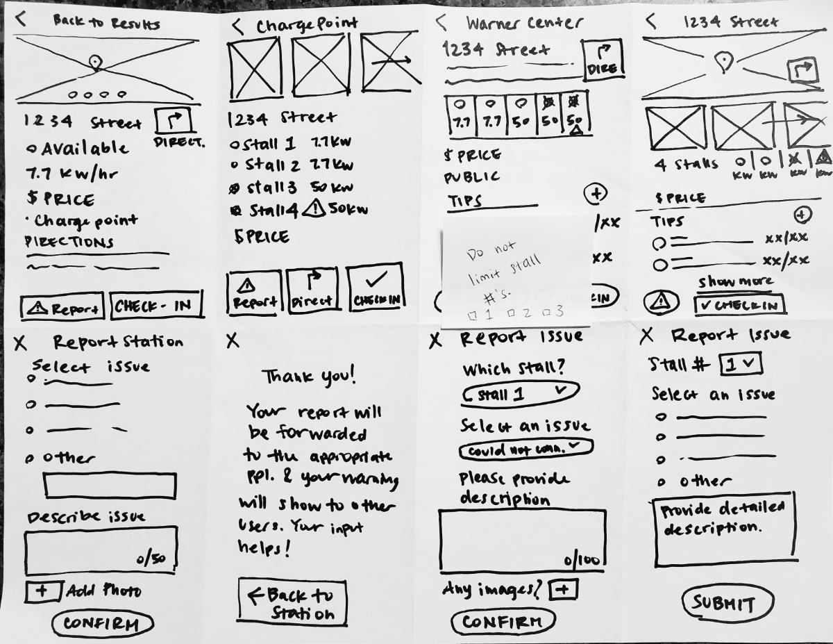
I imported the best of these sketches into Prott to create a prototype, and tested four users who were asked to complete the following tasks:
Through the usability test, I found the following issues with my design. I revised the wireframes and redrew them digitally in Notability.
The station preview on the map results page did not look interactive, thus testers were not inclined to tap it to reach the station's detail page.
I chose to put the preview in a card format with a drop shadow.
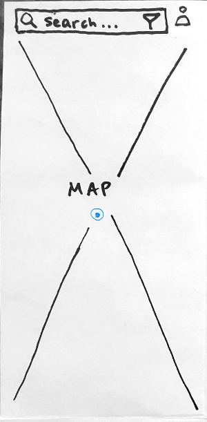
Original home screen/map
Revised home screen/map
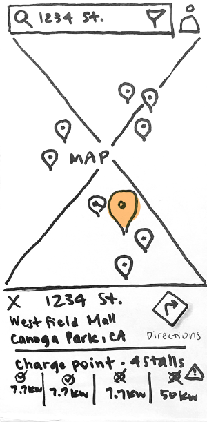
The map with the search results showed the searched address as a location pin, but it was unclear what it represented.
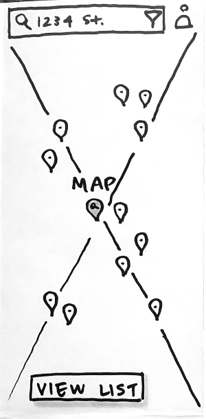
Original map search results
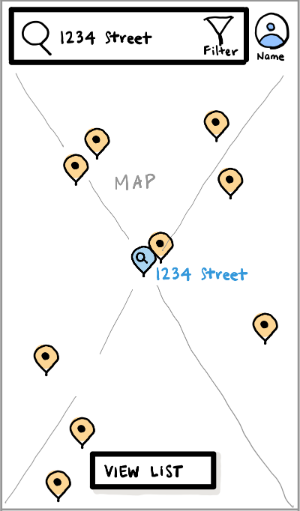
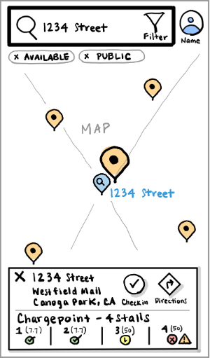
Map search results
This was one downside the lack of detail in the low fidelity sketch, but without a map and location pins, it was difficult for the user to orient themselves.
This will also have the added benefit of eliminating one step if users are searching for stations near their current location.
Original home screen/map
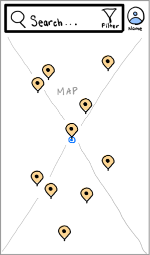
Revised home screen/map
I addressed the usability issues found in the testing by redrawing the screens digitally in Notability. This allowed me to wireframe more efficiently because I could copy and paste reused elements like buttons, icons, and text inputs.


In order to clarify and visualize the overall feeling for this app, I created a mood board based on keywords that best represent how users should feel about ZapEV.
Many of the images represent an idealistic and utopian perspective of our technological future. Pastel color palettes create a soft and natural vibe that reflect the sustainability motivations behind electric vehicle technology.


Display: Bree Serif
Headings: Montserrat
Body: Segoe UI
#F3F3F3
#FEFEFE
#54B590
#133656
#BCB8B8
#E6EBE0
#F69C87
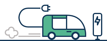
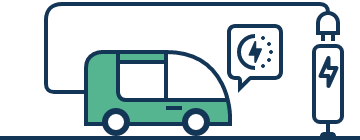
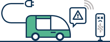
ZapEV's UI will primarily contain maps, icons, and text, but certain screens, like the sign-in page and confirmation screens, can benefit from illustrations that communicate the brand's values. The illustrations below are rounded and made from simple shapes, aligning with the brand's friendly identity.


On

Off

Checked

Unchecked
Selected
Unselected
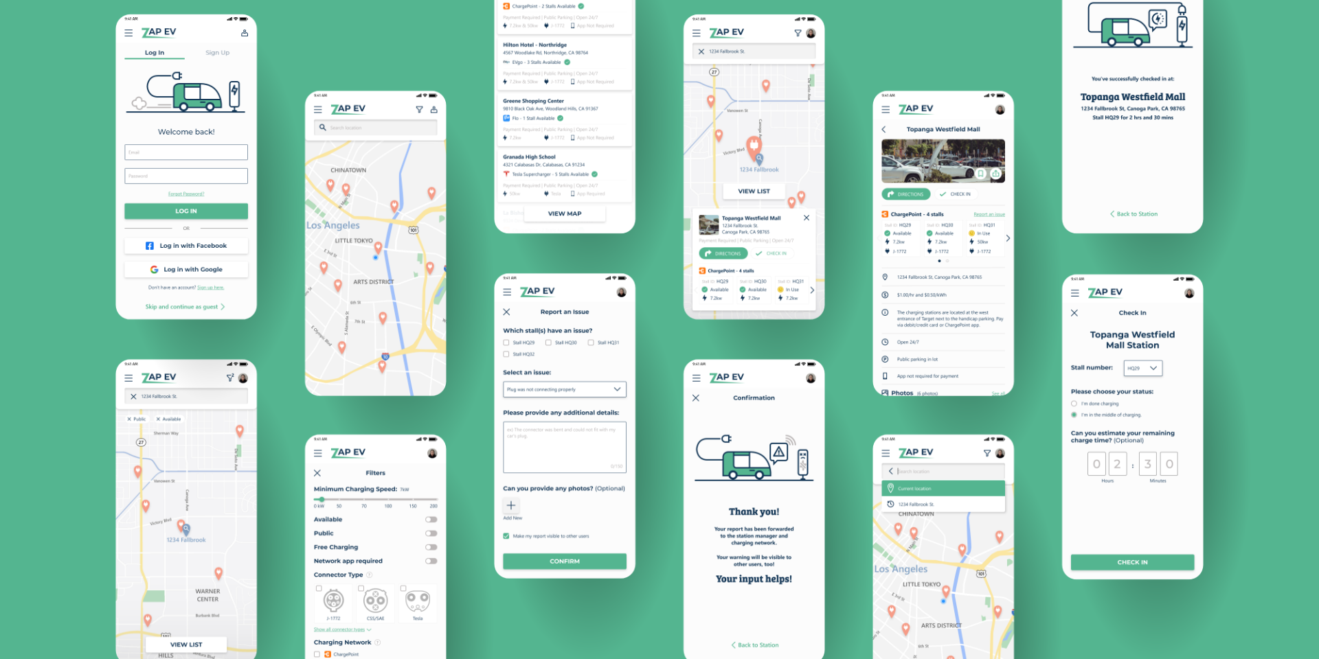

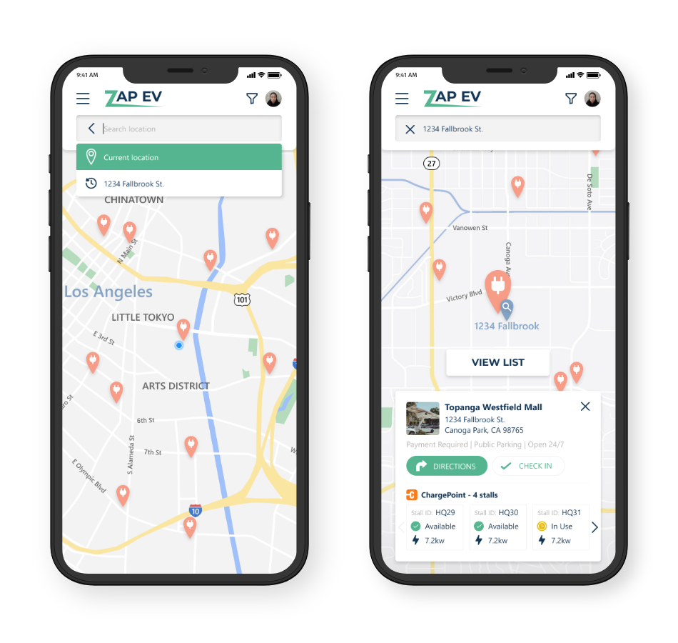
Begin with a map centered on the user's current location.

Tapping on the search bar shows suggested and recent locations.

Search results are first displayed on a map.

With the search results in list form, users can scan for more detailed information.
Users can filter results based on their most prioritized criteria, like price, network, and speed.

Filter Menu

Filtered results on a map

List of filtered results
By tapping on one of the location pins for a station, a small card will appear with its most pertinent information and primary actions. If the user wishes to view more information, they can tap the preview card to access the full station page.

A station's page has all of the information most EV drivers need to decide if they want to charge up there. This includes pricing, stall availability, operational hours, charging network, and accessibility. Users can check in to record their usage and let other drivers know when the stall is in use. Tips also alert other drivers to the nuances of each station.


Provide details of issue

Confirmation of receipt
Check in to stations to let others know that a stall is in use.

Check into a stall

Provide details

Confirmation
Leave a tip to let others know how to find or use the station properly.

Provide tip

Confirmation
